Why familiarizing oneself with cryptocurrency charts is crucial for traders; A complete introduction to Cryptocurrency charts. It is essential for traders to read cryptocurrency charts in order to find the best opportunities in the market. This is because the technical analysis can assist investors in identifying market trends and predicting the future price movements of an asset.
The term “technical analysis” refers to the process of examining statistical trends that have been gathered over a period of time in order to gain an understanding of how the supply and demand of a particular asset influence the future price changes of that asset.
By studying the charts of the cryptocurrency market, investors can improve the quality of their decision-making and better anticipate when bullish and bearish trends will come to an end.
A bullish movement is an upward price movement that is pushed by bulls, which are buyers of an asset. Bulls are responsible for a bullish movement. A bearish movement is a downward price movement that is pushed on by bears, which are sellers of the asset. Bears are responsible for bearish movements.
Traders can evaluate price trends and patterns on charts with the assistance of technical analysis, which can help them find trading opportunities. The best cryptocurrency charts are helpful for monitoring the movements of the market, but they do have a few limitations.
What is technical analysis?
The term “technical” refers to the process of analyzing the historical trading activity and price fluctuations of an asset. According to technical analysts, these factors have the potential to be useful predictors of the future price movements of an asset.
It is applicable to any asset that has historical trading data, including equities, futures, commodities, currencies, and cryptocurrencies, among other financial instruments.
Charles Dow, the creator of the Wall Street Journal and Dow Jones & Company, as well as the editor of that publication, was the first person to introduce the concept of technical analysis.
Dow was instrumental in the development of the very first stock index, which was known as the Dow Jones Transportation Average (DJT).
After Dow’s passing, his ideas were collected and compiled into what is now known as the Dow theory. These ideas were originally written down in a series of editorials that were published in the Wall Street Journal.
It is important to note that over the course of years of research, technical analysis has developed to incorporate the patterns and signals that are currently known to us.
The viability of technical analysis is contingent on whether or not the market has already factored in all of the information that is currently known about a particular asset, which would imply that the asset is currently fairly valued in light of the information.
Traders who rely on technical analysis and also make use of market psychology are of the opinion that history will eventually repeat itself.
Technical analysts may use fundamental analysis as part of their trading strategy to determine whether or not it is worthwhile to approach an asset.
They may then complement their decisions with an analysis of trading signals to determine when it is optimal to buy and when it is optimal to sell in order to maximize profit.
The purpose of fundamental analysis is to forecast the potential expansion of an asset by studying the financial information that influences its price.
When conducting a fundamental analysis of the shares of a company, one may look into the company’s earnings, the performance of the industry, and the value of the brand.
As a means of assisting traders in making decisions that are more informed, technical analysts are looking for ways to identify bullish and bearish price movements.
Dow theory and the six tenets of Dow theory
In 1884, Charles Dow was one of the people who contributed to the creation of the first stock market index. After the establishment of this index, the Dow Jones Industrial Average (DJIA) was established. The DJIA is a price-weighted index that follows the 30 largest publicly traded companies in the United States. It was established after the creation of this index.
Dow believed that the stock market was an accurate way to measure business conditions within the economy and that it was possible to identify major market trends by analyzing the data from the stock market.
The contributions made by a number of other analysts, such as William Hamilton, Robert Thea, and Richard Russell, have resulted in some modifications being made to Dow’s theory.
The emphasis placed on certain aspects of Dow’s theory shifted over time, including the sector in which it was placed, which was the transportation sector. Although investors continue to pay attention to the DJT, it is no longer considered a primary market index like the DJIA is.
The theory can be broken down into its core tenets, which are known collectively as the six tenets of the Dow theory. Let’s go through each of them, in turn, using the sections that follow.
Everything is reflected in the market.
The first tenet of the Dow theory is one of the most fundamental principles of technical analysis. This principle states that the prices of assets on the market reflect all of the information that is currently available, and that such information is priced appropriately.
For instance, the price of an asset will go up on the market if it is anticipated that the company will report positive earnings. The concept is very similar to what is known as the Efficient Market Hypothesis (EMH) in modern times. This hypothesis asserts that asset prices should reflect all of the information that is currently available and should trade on stock exchanges at their true value.
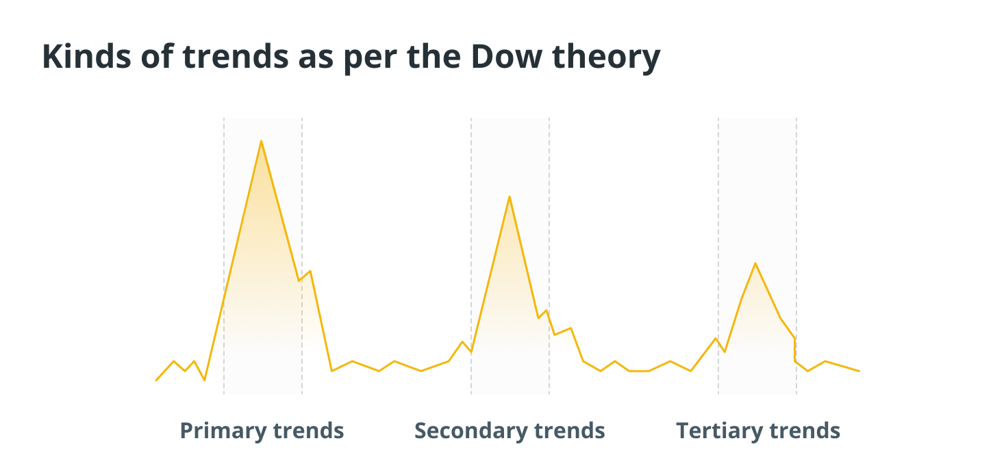
There are three distinct types of trends present in the market.
Dow’s theory also posits the possibility that market activity can be broken down into three distinct types of trends. Primary trends are the most significant movements in the market and typically continue for several months or even years.
The primary trend may be a bull market, which indicates that the prices of assets are increasing over time, or it may be a bear market, which indicates that the prices of assets are decreasing over time.
There are secondary trends that exist within these primary trends, and some of these secondary trends may work against the primary trend.
In bull markets, secondary trends can take the form of pullbacks, in which asset prices make a momentary retreat, and in bear markets, secondary trends can take the form of rallies, in which prices make a momentary ascent before continuing on their downward trend.
There are also tertiary trends, which typically last for a week or a little over a week and are commonly regarded as noise in the market that can be ignored because it won’t affect long-term movements. These trends tend to occur once every week or a little over a week.
Primary trends have three phases
Examining a variety of trends can help traders find profitable opportunities. During the course of a primary trend that is bullish, for instance, traders have the opportunity to profit from a secondary trend that is bearish by purchasing an asset at a lower price before the price continues to rise.
Recognizing these trends can be challenging, especially when the Dow theory is taken into consideration; according to this theory, primary trends can be broken down into three distinct phases.
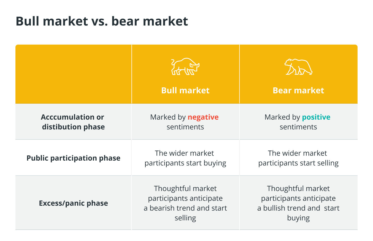
When market sentiment is still predominantly negative during a bull market or positive during a bear market, the market is still in the first phase, which is known as the accumulation phase for a bull market and the distribution phase for a bear market respectively. This phase occurs prior to the onset of a contrary trend.
During this phase, astute traders recognize that a new trend is beginning and either stock up in anticipation of a movement in the upward direction or spread their holdings in anticipation of a movement in the downward direction.
The name of second stage in the process is the public participation stage. During this phase, the broader market becomes aware that a new primary trend has begun and either begin selling assets to cut losses in downward movements or begins buying more assets to take advantage of upward price movements. During the second phase, prices will either rapidly increase or decrease.
When bull markets are present, the final phase is referred to as the excess phase, but when bear markets are present, it is called the panic phase. During the phase known as “excess” or “panic,” the general public will continue to speculate even though the trend is about to come to an end.
Participants in the market who are familiar with this phase will begin selling when they anticipate a primary phase that will be bearish or buying when they anticipate a primary phase that will be bullish.
Although there is no assurance that these trends will continue in the same direction, numerous investors take them into consideration before making their choices.
Indices must correlate
According to the Dow theory’s fourth tenet, a market trend is not considered to be established until both of the theory’s indices point to the beginning of a new trend.
If one index confirms a new primary upward trend while another index continues to be in a primary downward trend, traders shouldn’t automatically assume that a new primary upward trend is beginning, as the theory dictates that they should.
It is important to note that the two primary indices tracked by Dow at the time were the Dow Jones Industrial Average and the Dow Jones Transportation Average. These indices had a natural tendency to correlate with one another due to the close relationship that existed between the transportation market and industrial activity at the time.
Volume confirms trends
According to the fifth tenet of Dow theory, the volume of trading should increase when the price of an asset is moving in the direction of its primary trend, but it should decrease when the price is moving in the opposite direction of that trend.
Trading volume is a measurement of how much of an asset has been traded over a specific period of time, and it is regarded as a secondary indicator. Low trading volume is seen as a signal that a trend is weak, whereas high trading volume is seen as a signal that a trend is strong.
When a bullish primary trend is taking place on the market and a bearish secondary trend is seen at the same time with low volume, this indicates that the secondary trend is relatively weak.
In the event that the trading volume is significant during the secondary trend, this indicates that a growing number of market participants have begun to sell.
Trends are valid until a reversal is clear
The final tenet of the Dow theory is that trend reversals should be viewed with scepticism and caution. This is due to the fact that reversals in primary trends can easily be confused with secondary trends.
What are candlestick charts and how do they work?
Traders have access to a number of different kinds of charts, which enables them to examine and assess developments in the cryptocurrency market in a variety of different ways.
Because of the nature of candlesticks, crypto candlestick charts offer more information than other chart types.
Similar to line and bar graphs, candlestick charts for cryptocurrencies display the passage of time along the horizontal access and private data along the vertical axis.
The primary distinction lies in the fact that candlesticks reveal not only whether the price movement of the market was up or down during a specific time period but also to what extent this was the case.
Candlesticks are used to represent different timeframes on cryptocurrency market charts, which can be set to a variety of timeframes.
If, for instance, the timeframe of a cryptocurrency trading chart is set to four hours, then each candlestick will represent the trading activity for a period of four hours. The trading style and approach of a trader should inform their choice of the trading period.
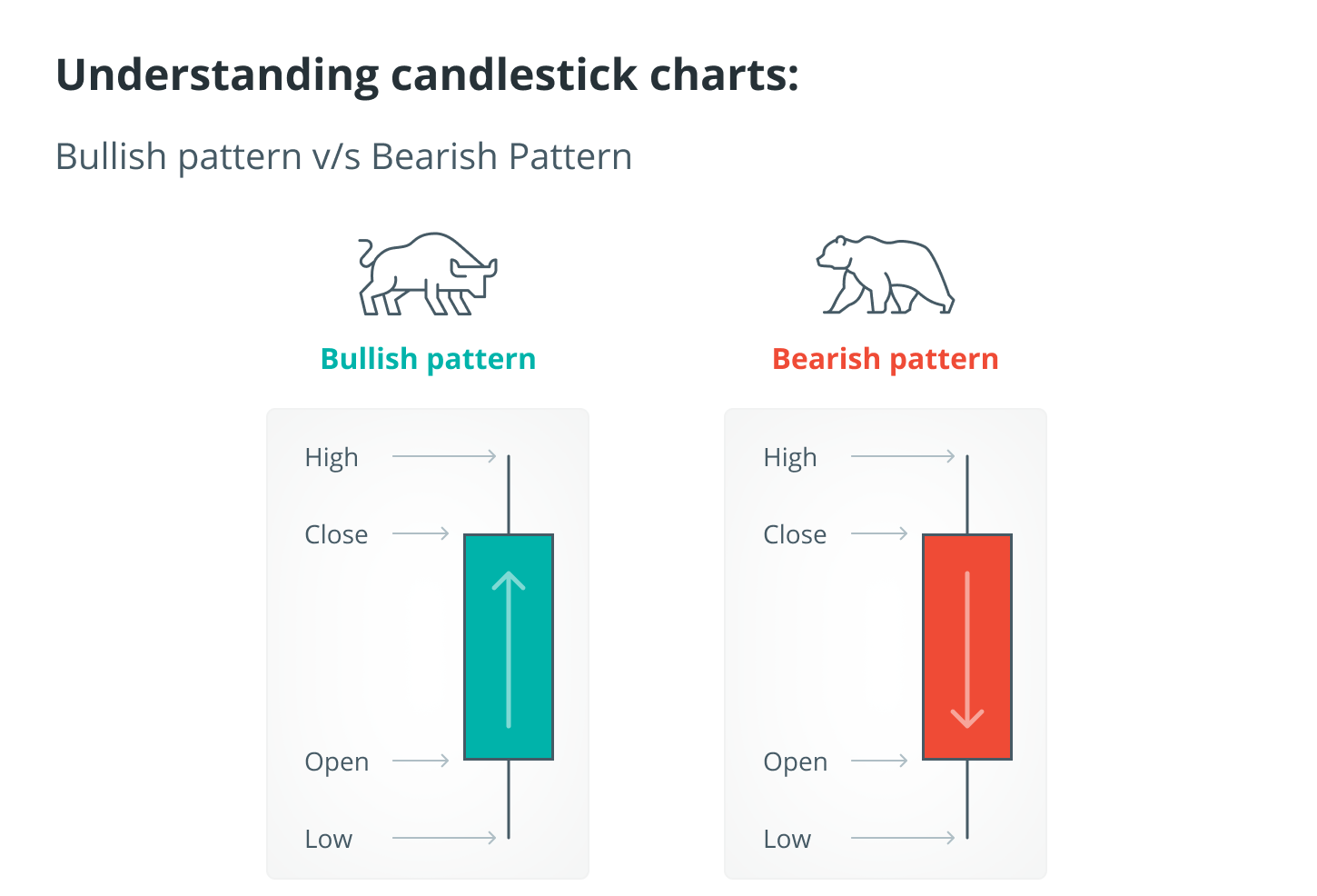
A body and wicks are the primary components of a candlestick’s construction. The body of each candlestick displays the opening and closing prices, while the wicks on the top show how high the price of a cryptocurrency got during that time frame and the wicks on the bottom show how low it got. The body of each candlestick displays the opening and closing prices.
In a similar fashion, candlesticks can be either green or red depending on your preference. The price went up over the time period that is being considered, as represented by the green candles, while the price went down, as represented by the red candles.
Users can glean a great deal of information from candlesticks despite their deceptively straightforward structure. Candlestick patterns can be useful for identifying potential trend reversals, for example, which can be used by technical analysts. Candlestick patterns can be bullish or bearish, and traders in cryptocurrencies should be aware of both.
For instance, if the wick at the top of the candle’s body is particularly long, this might indicate that traders are taking profits and that a market decline is imminent.
On the other hand, if the wick is particularly long at the bottom, this could indicate that investors are purchasing the asset whenever the price falls.
In a similar vein, a candlestick in which the body occupies almost all of the space and has very short wicks may indicate that there is strong bullish sentiment if the colour of the candlestick is green and strong bearish sentiment if the colour is red.
A candlestick on the other hand that has almost no body and long wicks is a signal that neither the buyers nor the sellers are in control of the situation.
Support and resistance levels
The use of support and resistance levels, which can be located through the application of trendlines, makes it simpler to read live crypto candlestick charts. On charts, trendlines are the lines that are created by connecting a number of price points.
Support levels are points in price during pullbacks at which it is anticipated that cryptocurrencies or any other asset will halt due to a concentration of buying interest at that level. Support levels are also known as price floors.
A price level is considered to be at a resistance level when there is concentrated selling interest at that price point. Because of the concentration of buying and selling interests, it is difficult to break through these levels.
Crypto chart patterns can be more easily recognized with the help of trendlines, which allow for the identification of support and resistance levels.
When constructing an uptrend line, the lowest and second-lowest lows for a given timeframe are used to determine the price of a cryptocurrency. The levels that are close enough to touch this trendline are considered to be supported.
The highest and second-highest highs of the cryptocurrency are used to draw a downtrend line, and any levels that touch this line are considered to be resistance levels.
Downtrend lines are utilized during downtrends, whereas uptrend lines are utilized during uptrends, as the name suggests. The use of trendlines, as well as support and resistance levels, can inform a variety of trading strategies.
For instance, some technical analysts just buy near the support of uptrend lines and sell near the resistance of the downtrend lines. Others simply buy near the intersection of two uptrend lines.
It is not uncommon for the price of a cryptocurrency to remain relatively stable, moving only slightly up or down. For example, the price of Bitcoin (BTC) fluctuated between $6,000 and $6,500 between September and November of 2018, before falling to $3,200 by December of that year.
In this instance, the levels of support are located at the bottom of the range, while the levels of resistance are located at the top of the range. If the price of the cryptocurrency drops below that range with a strong price movement, a breakdown may occur. On the other hand, a breakout may occur if the price of the cryptocurrency moves upward with a strong price movement.
Using long-term moving averages is another method that can be utilized to ascertain support and resistance levels. These are common types of technical indicators that are used to smooth price data by generating an average price that is constantly updated.
What exactly do moving averages measure?
One of the most popular kinds of technical indicators is known as a moving average (MA), and it filters out the majority of the background noise in the market by calculating an average price for a particular cryptocurrency.
Moving averages can be tailored to specific time periods and provide traders with actionable signals when analyzing real-time crypto chart data.
The most typical time periods for which moving averages are calculated are 10, 20, 50, 100, and even 200 days.
This help makes market trends more obvious, with a moving average of 200 days being seen as a level of support during an uptrend and a level of resistance during a downtrend in the market.
The moving averages that traders use can be broken down into a few distinct categories. A simple moving average, also known as an SMA, is calculated by adding up the asset’s average price over a given time period and dividing that total by the total number of time periods.

A weighted moving average, also known as a WMA, gives more importance to more recent prices in order to make the average more sensitive to recent shifts. In a similar manner, an exponential moving average (EMA) assigns a greater degree of significance to more recent prices; however, it does not maintain consistency with the rate of decline between one price and the price that came before it.
Because they are calculated using historical data, moving averages are considered to be lagging indicators. Moving averages are frequently utilized by traders as signals to buy and sell assets, with the periods being determined based on the traders’ respective timeframes.
When the 50-day simple moving average (SMA) crosses below the 200-day simple moving average (SMA), a so-called death cross is formed, which suggests an impending price drop. The 50-day SMA and the 200-day SMA are closely monitored in cryptocurrency trading charts.
A golden cross is formed in the price chart when the 50-day simple moving average (SMA) goes above the 200-day simple moving average (SMA), which is indicative of a price increase.
Other main technical indicators
In the following, we will investigate a variety of other well-known technical indicators that are currently available.
On-balance volume indicator (OBV)
The on-balance volume indicator is a type of technical indicator that focuses on the amount of trading activity in a cryptocurrency.
Joseph Granville came up with the idea for it with the presumption that the trading volume was a significant factor in determining how prices moved in the markets.
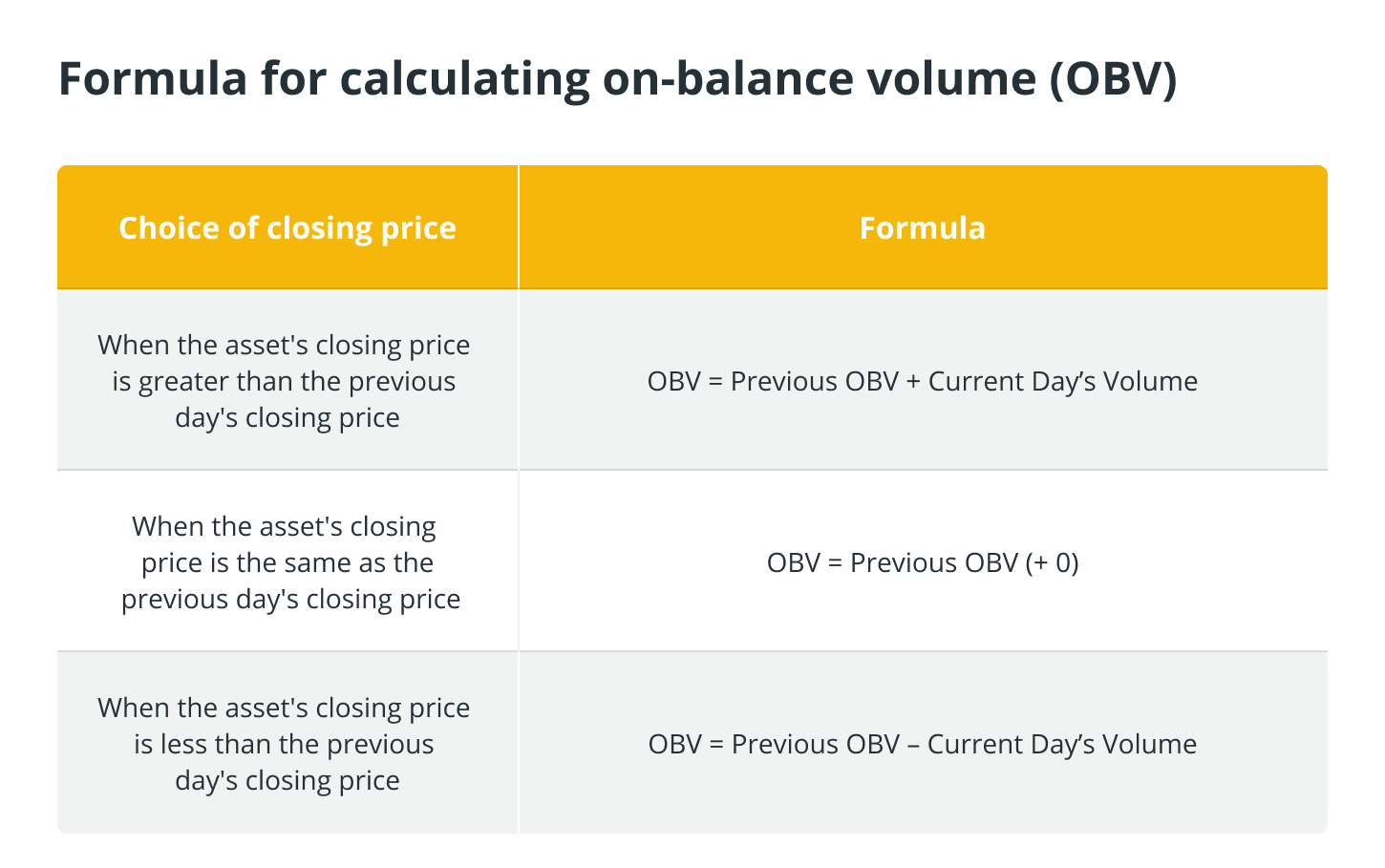
The OBV is a cumulative indicator that moves up and down depending on the trading volume of the days that are included in a given time period.
It is used to confirm trends, such as when looking at live crypto charts, traders should see rising prices accompanied by a rising OBV. This is important information for them to have. A decrease in the OBV is expected to coincide with declining prices.
The OBV can be computed using a few different methods, which are as follows:
Moving average convergence divergence (MACD)
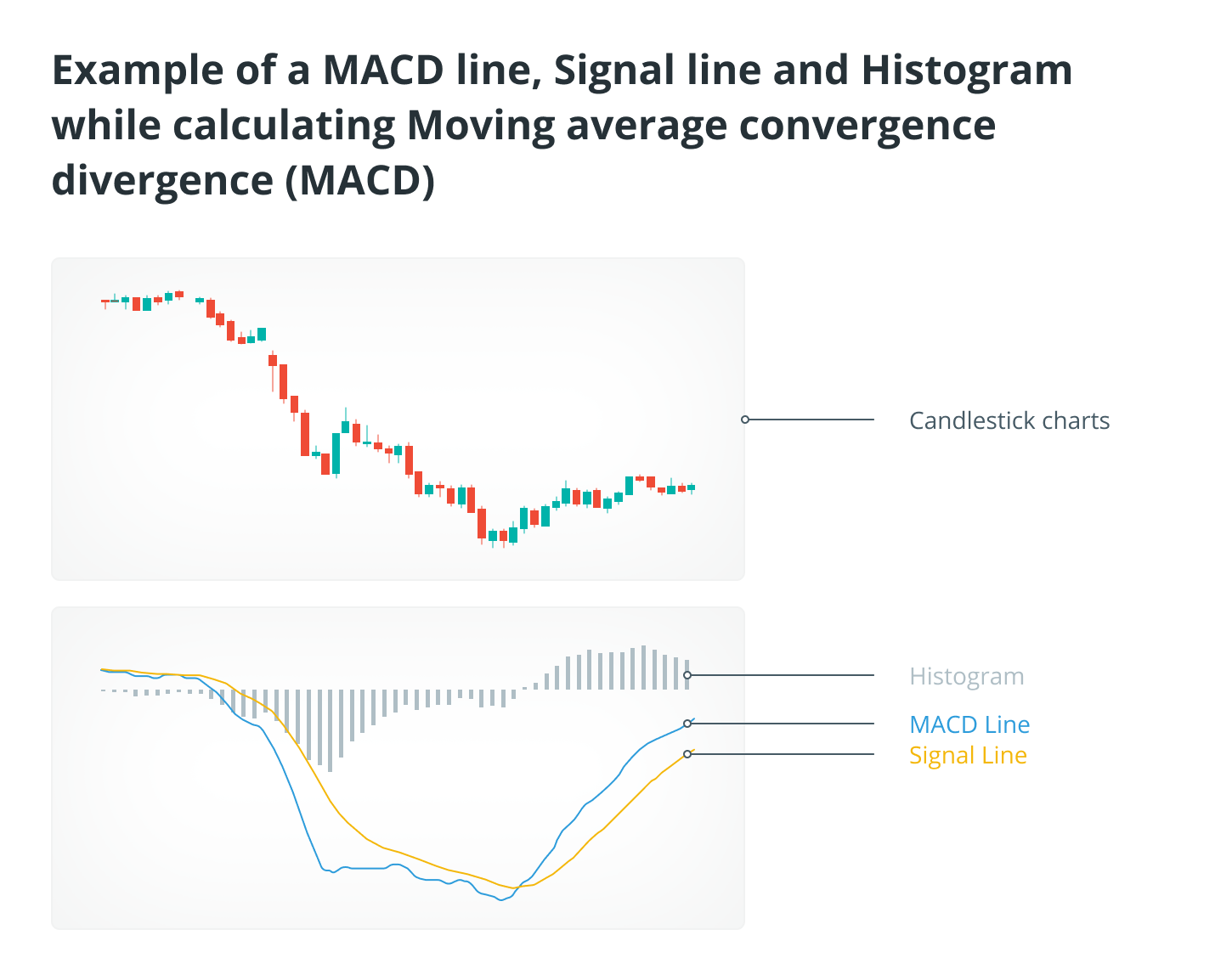
The moving average convergence divergence, also known as the MACD line, is an indicator that is used to identify buy and sell signals. The MACD line is formed by measuring the difference between the 12-day and 26-day exponential moving averages (EMAs). It is what’s known as an oscillator, which simply refers to a type of indicator that moves above and below a centered line.
When the MACD displays a sell signal, it indicates that it is time to sell the asset that is being considered, whereas when it displays a buy signal, it indicates that it is time to purchase the asset. The greater the gap that exists between the two lines, the more accurate the reading provided by the MACD!
The indicator also includes a signal line, which is a nine-day exponential moving average (EMA). When the MACD crosses above the signal, it frequently indicates that it is time to buy, and when it crosses below the signal, it indicates that it is time to sell.
A histogram that can measure the gap between the MACD and the signal line is incorporated into the MACD indicator.
The Relative Strength Index (RSI)
The relative strength index, also known as RSI, is a momentum indicator that can be utilized to determine whether or not a particular asset is currently overbought or oversold.
The Relative Strength Index (RSI) is represented graphically as an oscillator, which is a line that runs between two extremes, and its value can range anywhere from 0 to 100.
When using a timeframe of 14 days, the indicator determines that a cryptocurrency has been oversold when its value falls below 30, and that it has been overbought when its value rises above 70. When a market is overbought, this is a signal to sell, while when it is oversold, this is a signal to buy.
Bollinger bands
Bollinger bands are a technical indicator that was developed by John Bollinger to assist traders in identifying short-term price movements in the prices of assets such as cryptocurrencies.
A moving average of 20 days is used to calculate the Bollinger bands, and then a standard deviation is added to or subtracted from the moving average.
The Bollinger bands can have their parameters customized to meet the trader’s needs, and the bands can be made to widen or narrow depending on the price of the cryptocurrency.
The bands display stretches of increased or decreased volatility and are not intended to be utilized on their own but rather in conjunction with additional indicators.
When the price of a cryptocurrency moves above the upper band, this is referred to as an “overbought” condition, whereas when the price moves below the lower band, this is referred to as an “oversold” condition.
Bollinger bands are based on the idea that periods of low volatility are followed by periods of high volatility. Given that period of low volatility is followed by periods of high volatility, the separation of the bands during periods of high volatility indicates that the current trend may be coming to an end. In a similar vein, when the bands are relatively close to one another, it is possible that the asset is about to enter a period of high volatility.


